
Elevate K-12 · EdTech & SaaS
Elevate K-12: a seamless HR portal for teachers
UX and UI design for an HR portal that carries a teacher candidate from application through testing to scheduling an interview, built to fit seamlessly with the company's brand.
- Client
- Elevate K-12
- Industry
- EdTech & SaaS
- Stage
- Growth-stage
- Outcomes
- New platform
- Work
- UI/UX Design & Research, Product Design, Web Application
- The challenge1/3
- Elevate K-12's updated HR portal needed a clear experience for teacher candidates, from applying for a role to scheduling an interview, that fit seamlessly with the company's brand.
- What we did2/3
- UX and UI design for the whole candidate journey, starting from the dev team's workflow and low-fidelity wireframes.
- The result3/3
- A portal experience designed around the candidate, from application through testing to the interview, that fit Elevate K-12's brand.
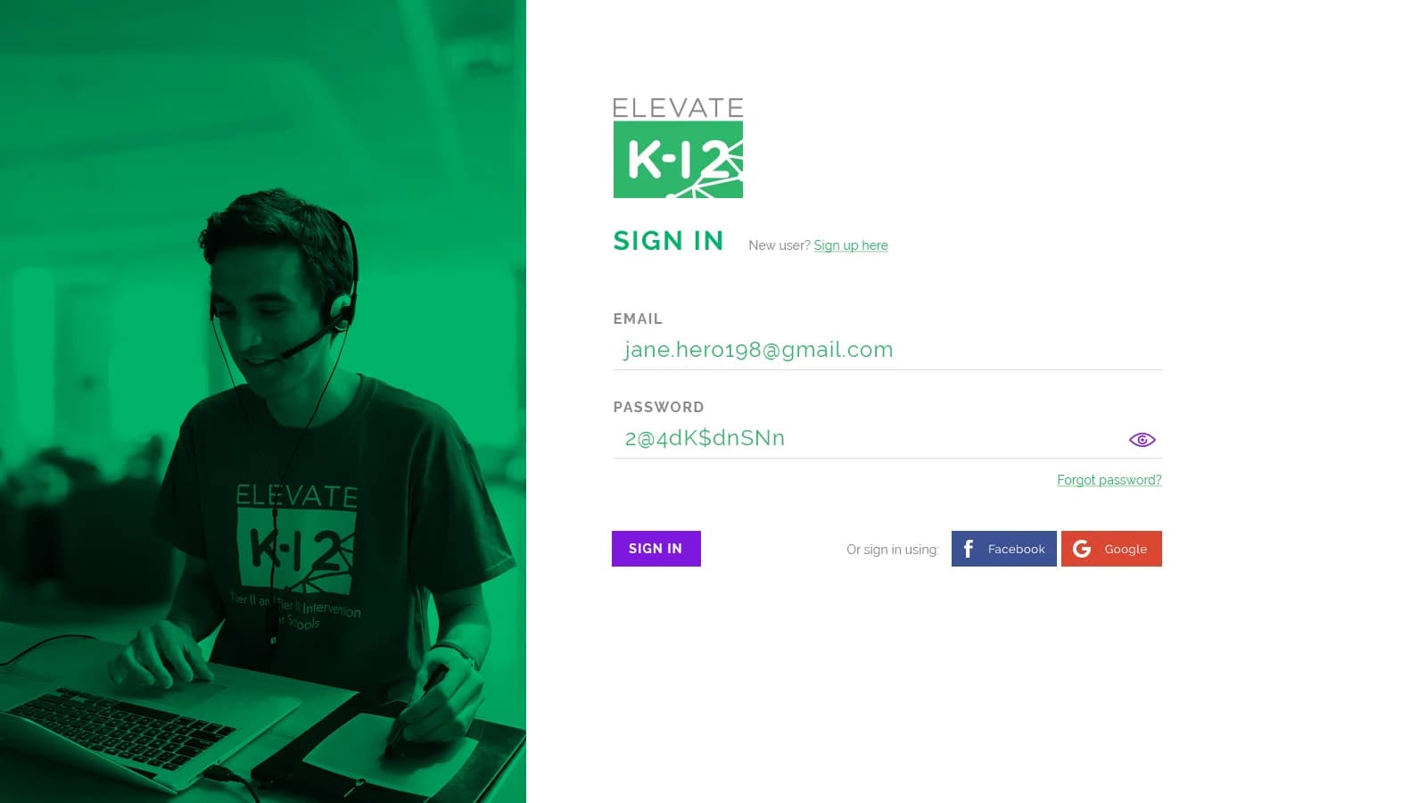
Elevate K-12 is passionate about creating high-quality teaching and learning opportunities for teachers and students. Their HR portal was where teacher candidates applied for online teaching positions.
The problem
Elevate K-12 needed the user experience defined for a teacher candidate on their updated HR portal: from the moment someone applies for an online teaching position, through adding their experience and taking the tests, to scheduling their interview. They also wanted the portal web application to fit seamlessly with the company's branding.
Their dev team shared the application's workflow and low-fidelity wireframes before we started. The wireframes showed some ways of filling in and showing information, and the team was entirely open to new and better approaches.
Starting point
- The app's workflow
- Low-fidelity wireframes
- Ways of filling in information
- A candidate experience still to define
What we designed
- Applies for a teaching role
- Adds their experience
- Takes the tests
- Schedules the interview
What we built
- Candidate applies
- Interview scheduled
Our part: the experience in between.
- UI/UXApplying for a roleWhere a candidate applies for an online teaching position.
- UI/UXAdding experienceWhere the candidate adds their teaching experience to the application.
- UI/UXTaking the testsWhere the candidate takes the tests for the role, inside the same portal.
- UI/UXScheduling the interviewThe last step, where the candidate books their interview for the role.
- UI/UXDesigned around the candidateNew and better approaches than the first wireframes, built for the person applying.
- UI/UXUI that fits the brandThe HR portal looked and felt like the rest of Elevate K-12.
- BrandSales and marketing collateralA customer success story, flyers, one-pagers, a conference ad, a summer school brochure and landing page, and a set of subject icons.
The portal wasn't the only thing we made. Our handoff files also hold the sales and marketing pieces we designed for Elevate K-12: a customer success story, Tier 1 and Tier 2 flyers, one-pagers, a conference ad, a summer school brochure and landing page, and a set of subject icons.
The results
Elevate K-12 got a candidate experience designed end to end, from the first application to the scheduled interview, that fit their brand. As a startup working to very short deadlines, they valued the speed and flexibility as much as the design.
“The combination of a superior eye for design and speed and flexibility makes Chykalophia hard to beat. As a startup we work on super short deadlines, and Ari was outstanding: flexible, quick, and consistently exceeding expectations.”
If your app is still a set of wireframes too
A quick check shows where people get stuck in your site's flow today, before you design the next version.
Quick check · 3 questions
Does your site have Elevate K-12’s old problems?
- Is the experience in your app defined from the first step to the last?
- Are your screens designed around the user, beyond the form fields?
- Does your app look and feel like the rest of your brand?
Answer all three to see where you stand (0 of 3).
Check it yourself, free
See where people get stuck on your site
The free Conversion Leak Scorecard checks your site for the gaps that send visitors away.
Want the full picture first? How we approach UI/UX design
Or talk it through
A free call with Ari and Peter
Up to an hour with the co-founders on your catalog, your buyers and where the site loses them.
Book a callMore results
 HealthTech & SaaS
EazyScripts
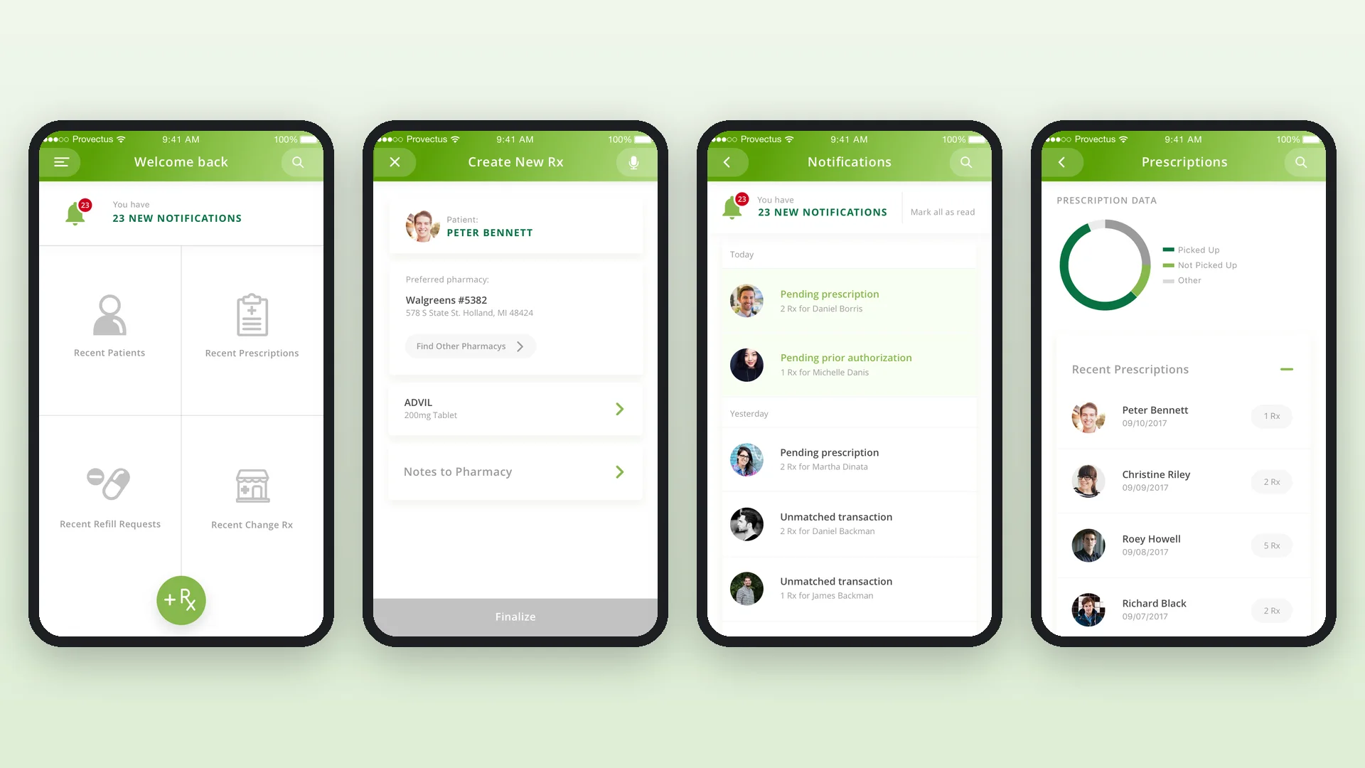
A mobile app for iOS and Android that lets doctors and physicians prepare prescriptions faster, without needing to reach for a desktop computer.
Read the case study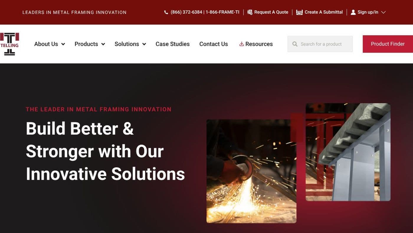 B2B Manufacturing
Telling Industries
A metal framing manufacturer with a technically complex product line had no real way to show it online. We rebuilt the brand, the site and the path to a sales call, plus a custom product configurator, and qualified leads tripled within a month of launch.
Read the case study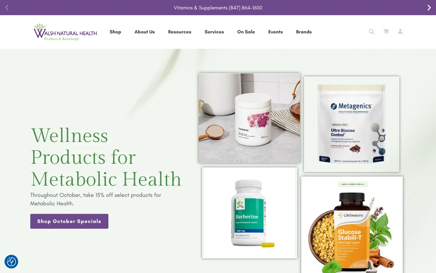 E-commerce · Health & Wellness
Walsh Natural Health
A quality wellness product was buried behind a website that couldn't convert. We rebuilt it on conversion-first architecture with brand strategy from the ground up, and orders doubled in the first month.
Read the case study

